
In 2024, I joined Walmart's User Experience team to focus on the finance ecosystem within their product suite. As one of the world’s largest retailers, Walmart offered a unique opportunity to design for a platform serving millions of users globally, contributing to a high-impact experience in a $642.6 billion net sales revenue ecosystem.


Primary tools
Annually
Before
-$12M
After
+5m
Annually
Before
45 min
After
30 secs
Assuming
$15 hr rate
Single ease question (SEQ)
Before
4 / 7
After
6 / 7

ME@MyGNFR is a native iOS and Android e-commerce application, supported by a responsive desktop experience, that enables associates to order and track essential items needed for their departments (e.g., restocking toilet paper for bathrooms). The product was designed within a six-month timeline.
To ensure the solution met the needs of its users, I conducted interviews with 10 associates across two Walmart Supercenters. Over the course of two days, I worked closely with store managers and upper management to identify challenges in the ordering and tracking process. These insights guided the development of features to streamline operations and enhance the user experience for associates.
2
Missing feature

1
Information revision


1
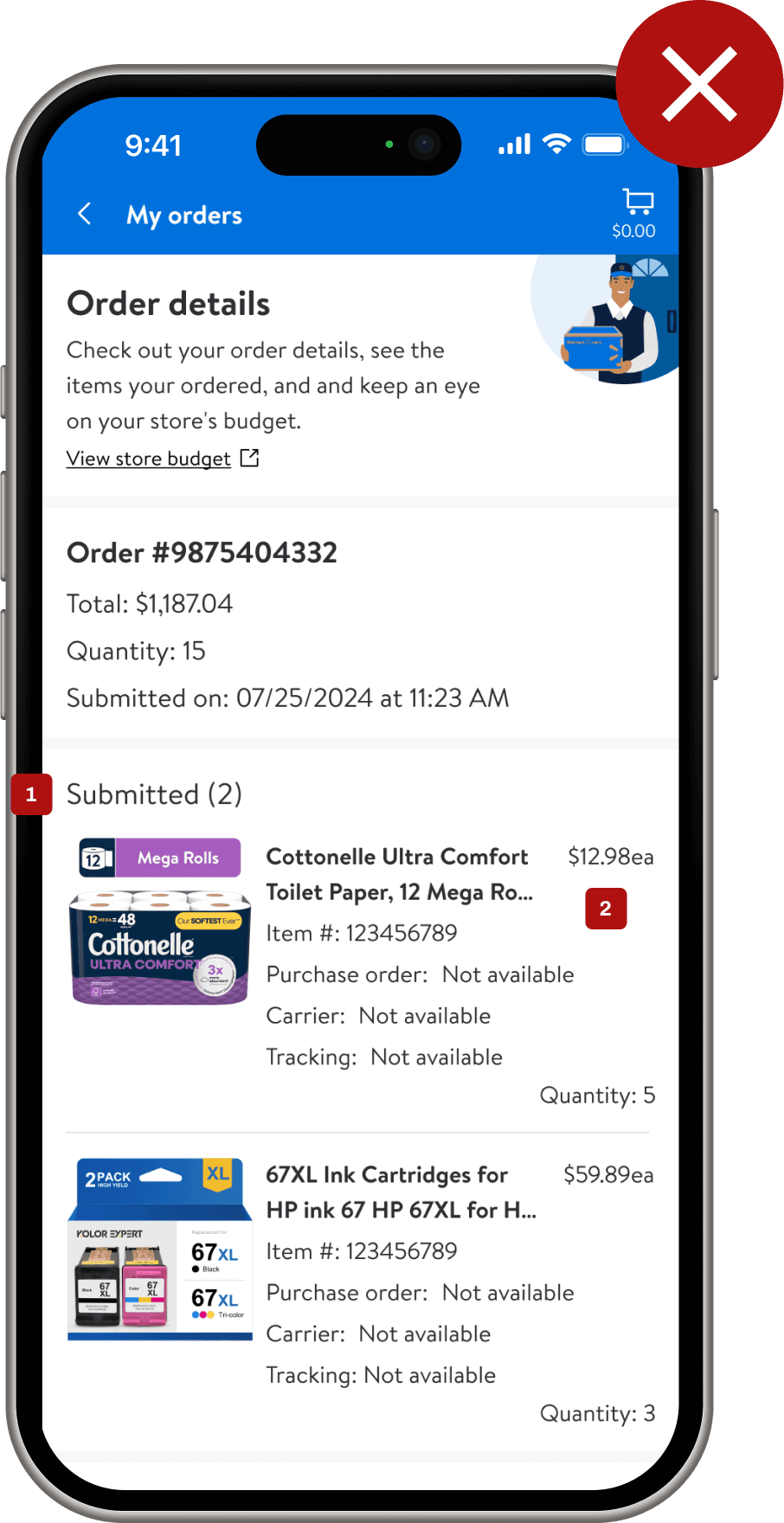
Display images
Sense users are primary identifying orders my the products in them. I expose the first four product images that are attached to an order so that users are able to quickly identify the orders they are looking to find quickly.
2
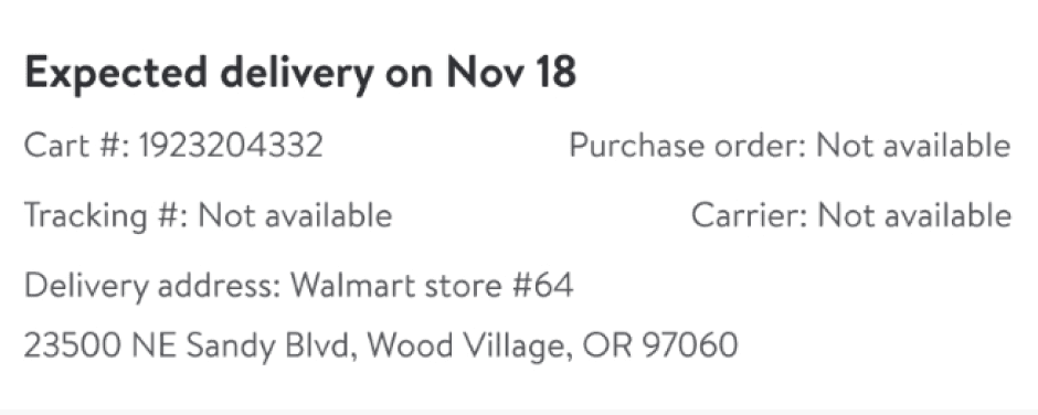
Streamlined Delivery Details
I simplified the high-level information displayed to users, focusing solely on the essential delivery details to help them quickly identify the product they need.


1
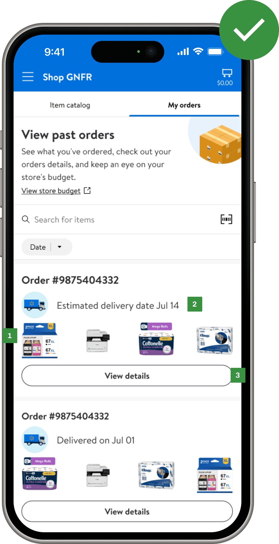
Improved tracker
I restructured the wizard tracker into a new experience called the "Spark Tracker." Using the Walmart logo, it displays order progress and key information across six defined steps in the tracking process.


This project involved working with two different platform states. The native Me@Walmart experience had logic to break out products by status, while the responsive version had not yet been updated to reflect these changes. Our challenge was to balance and unify the two mobile versions to deliver a seamless experience, achieved by introducing the new "Spark Tracker" UI component.
There were three designers collaborating on this project, located in Seattle, Bentonville, and Austin. This setup allowed us to support one another in conducting in-store research and gather diverse user data nationwide, providing a broader perspective on user needs.
Looking back, I would aim for a more 1-to-1 alignment between the mobile app and responsive versions. However, to maintain consistency, we adhered to similar patterns across platforms.
See Ruggable Project